Webhelp
We envisioned an office environment that is vibrant, playful and ergonomic, embodying the modern approach of an industry leader like Webhelp.
A key concept within the design and build was that of connection, and how we can connect the employees through functional yet creative areas, that serve as agile environments. Our approach was around the concept of contagious energy and creating a space that is magnetic in its appeal, uplifting and exciting. This included a strong use of colour and brand focused elements to add to the energy, with bold lines and shapes within the interior architecture itself.
The use of textures and patterns add to the vibrant appeal of the workspace, and we looked to the surfaces and walls to further express the brand ideology.
The people-first approach to the design prioritised ergonomics, well-being and talent retention to create a workplace environment that team members enjoy, are comfortable in and one that makes them know they are valued.
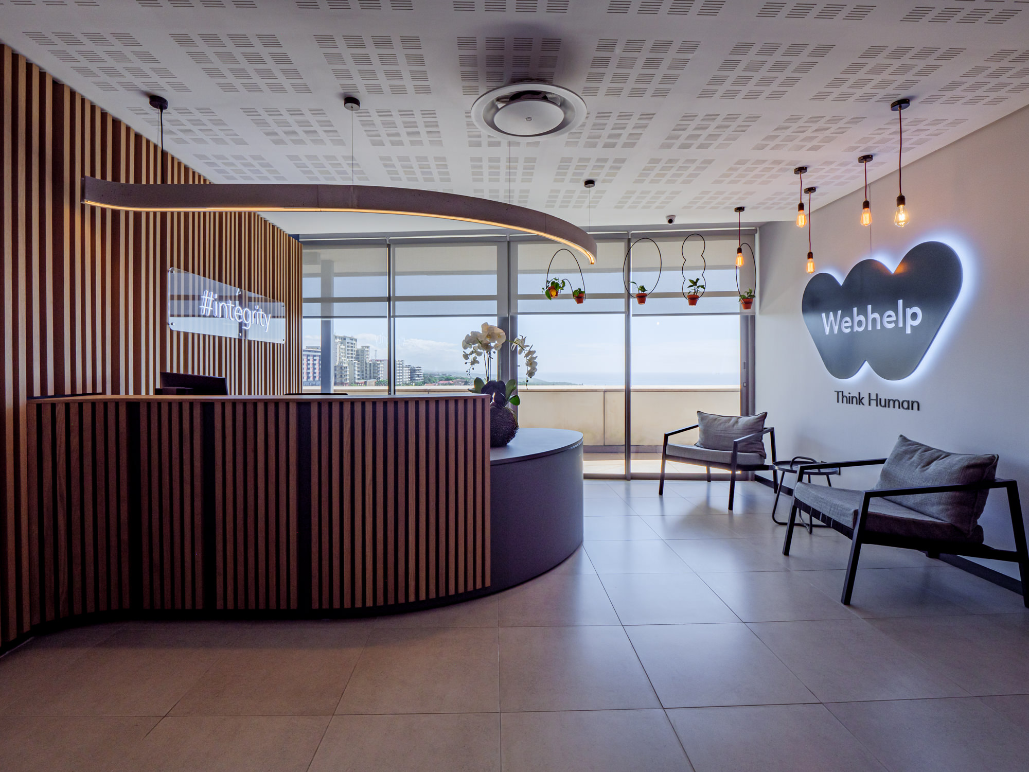
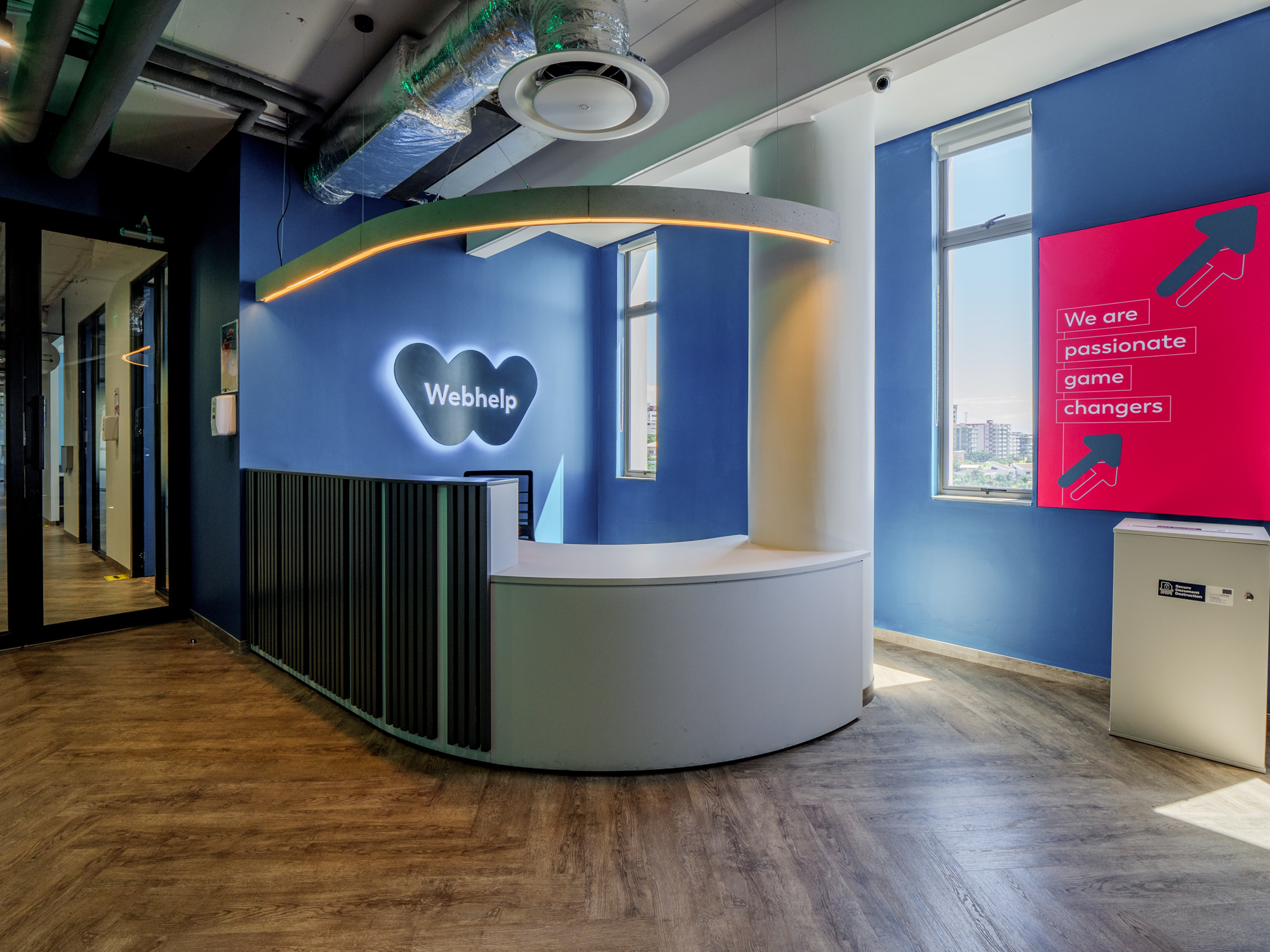
As the welcome area to visitors at Webhelp we envisioned something that was energetic and immediately gave you a sense of what this innovative and vibrant company is about. This area also had to be warm, welcoming, and functional, perfect for informal chats, quick catch ups, breakaways, or even more structured meetings.
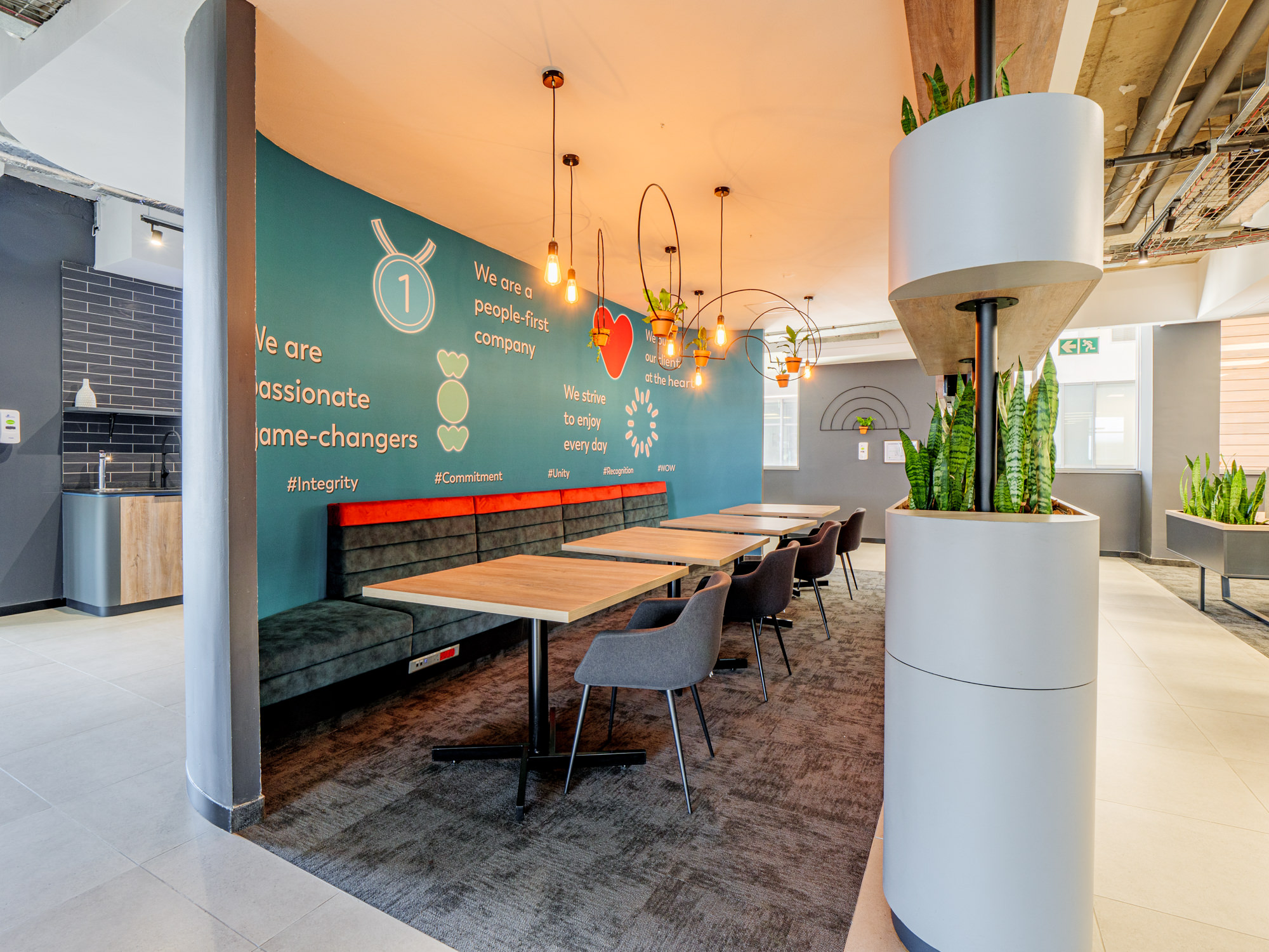
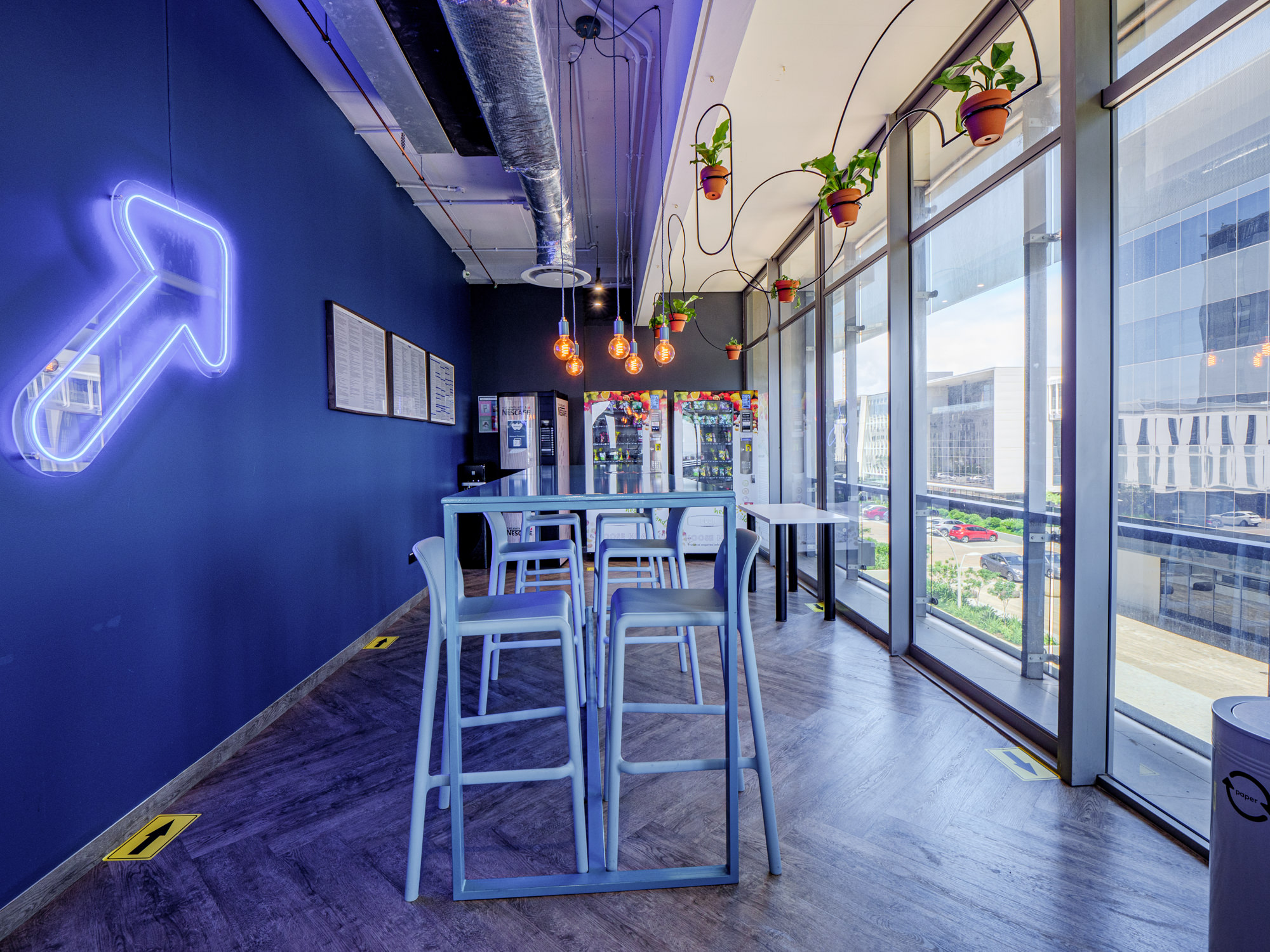
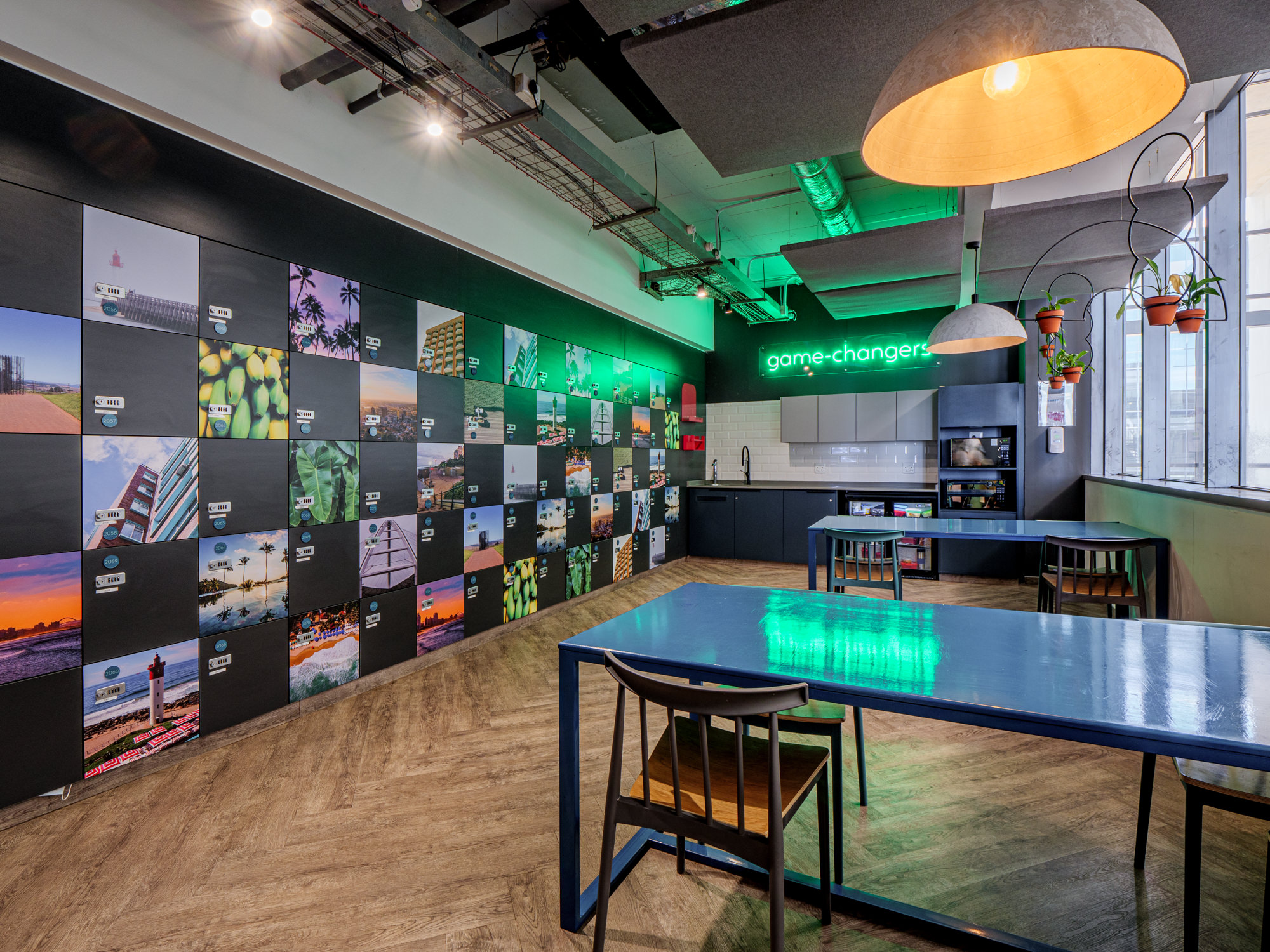
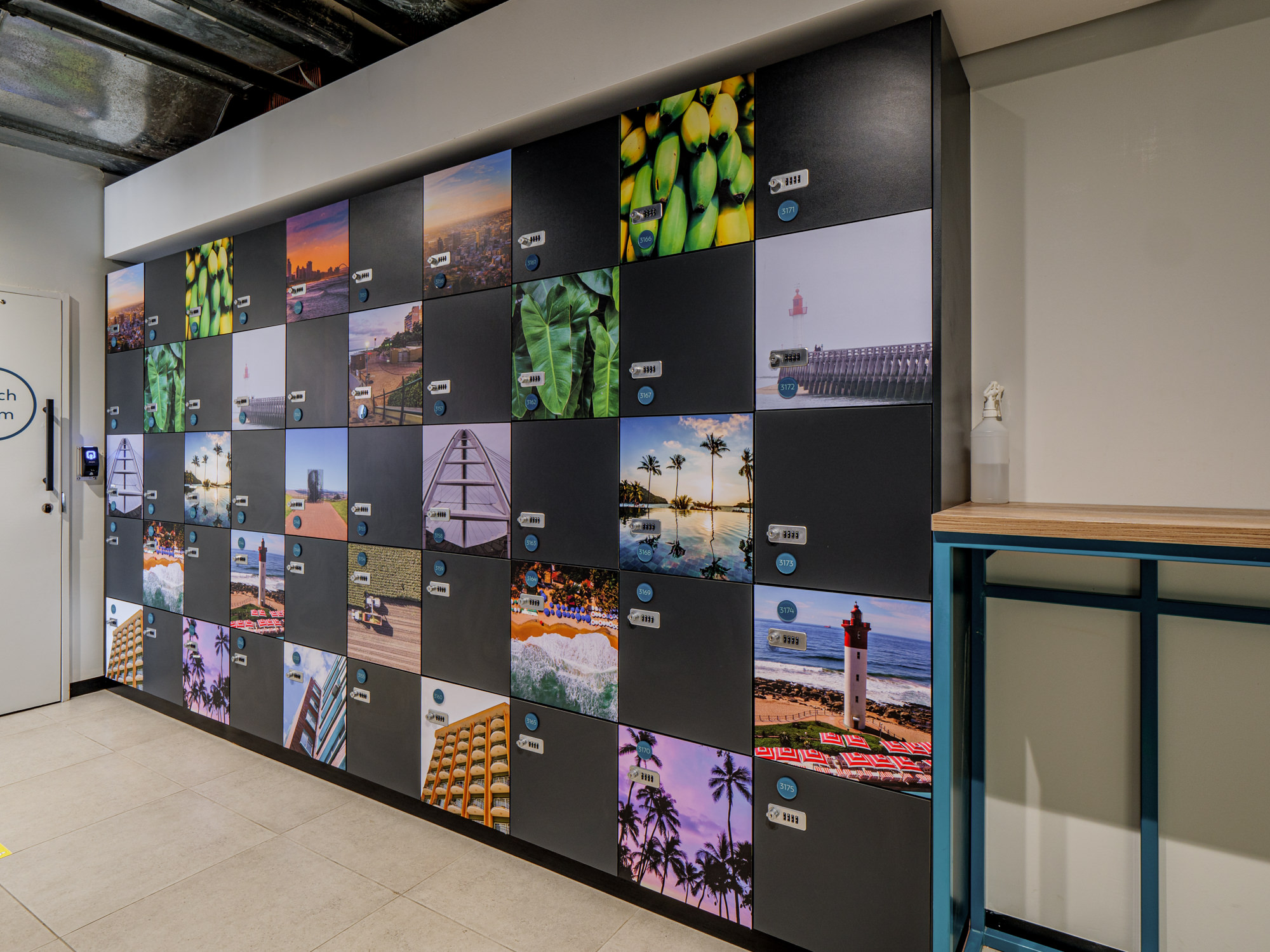
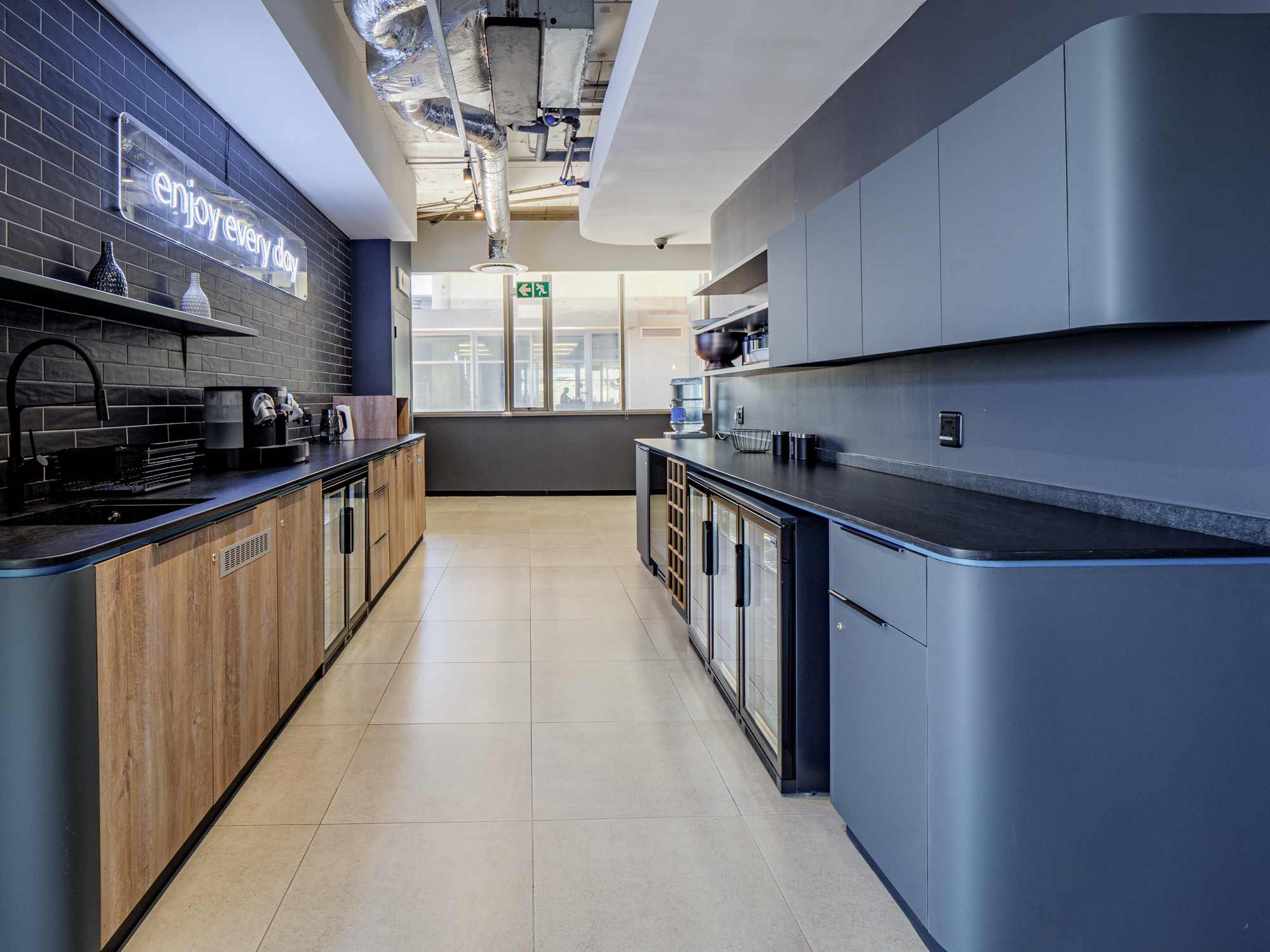
The plaza and canteen areas are pivotal to the Webhelp employee experience, being the hub of their interactions. These open, inviting spaces offer a variety of seating, encouraging collaboration, relaxation, and connection. Some are unconventional, and feature custom visuals, decals and lighting. Architectural features throughout these areas, pay homage to the friendly, organic shapes of the Webhelp brand.
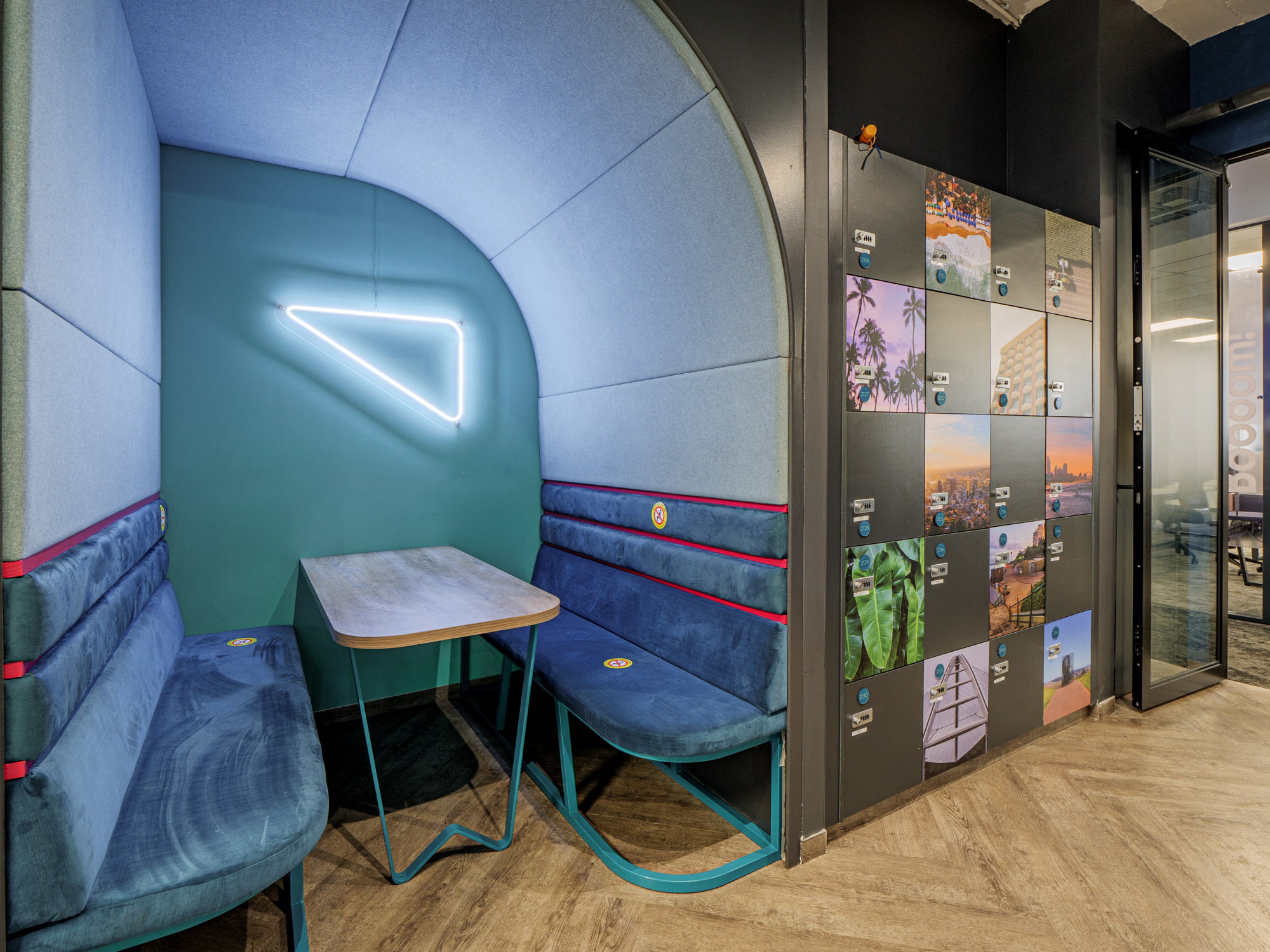
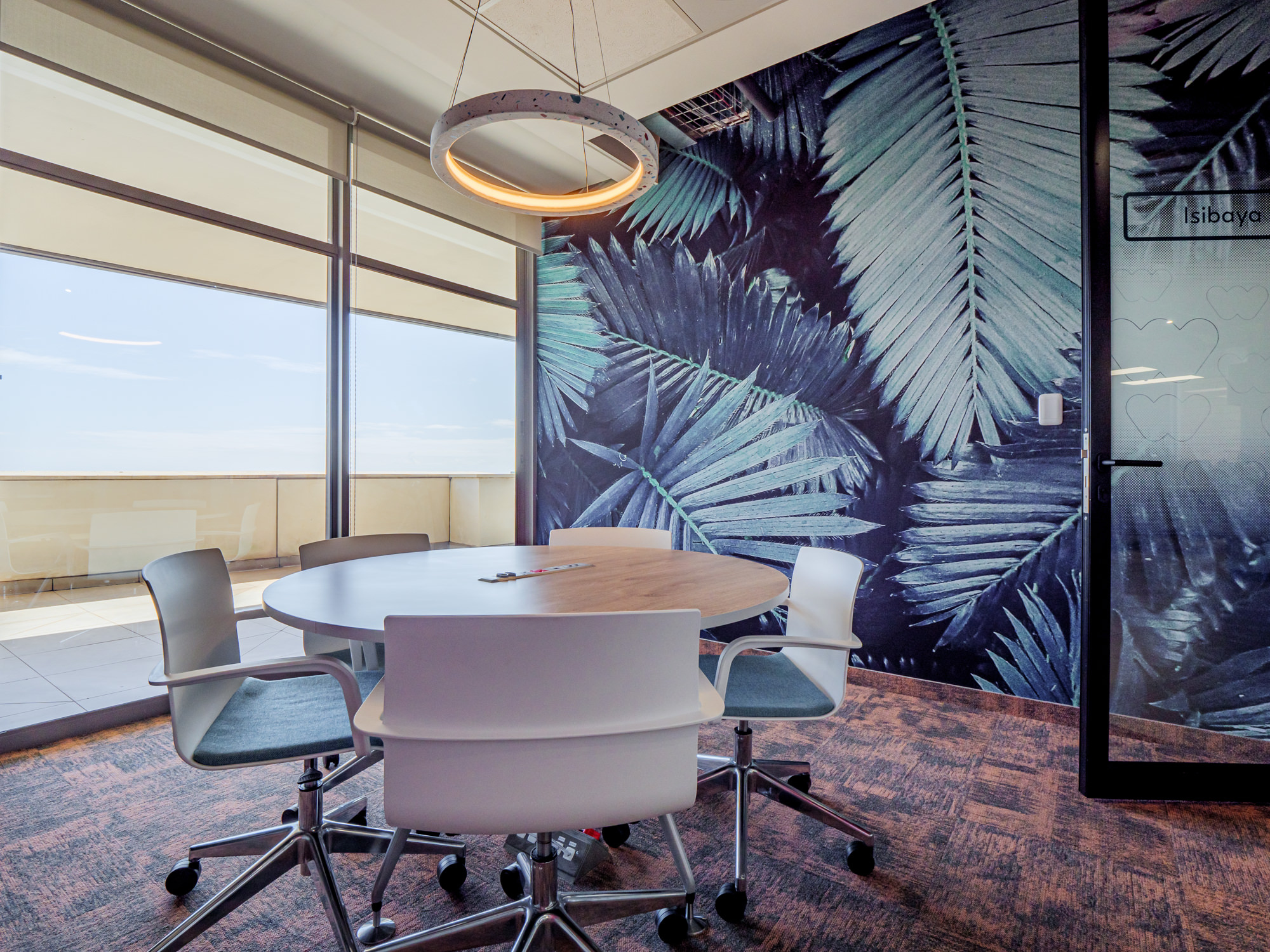
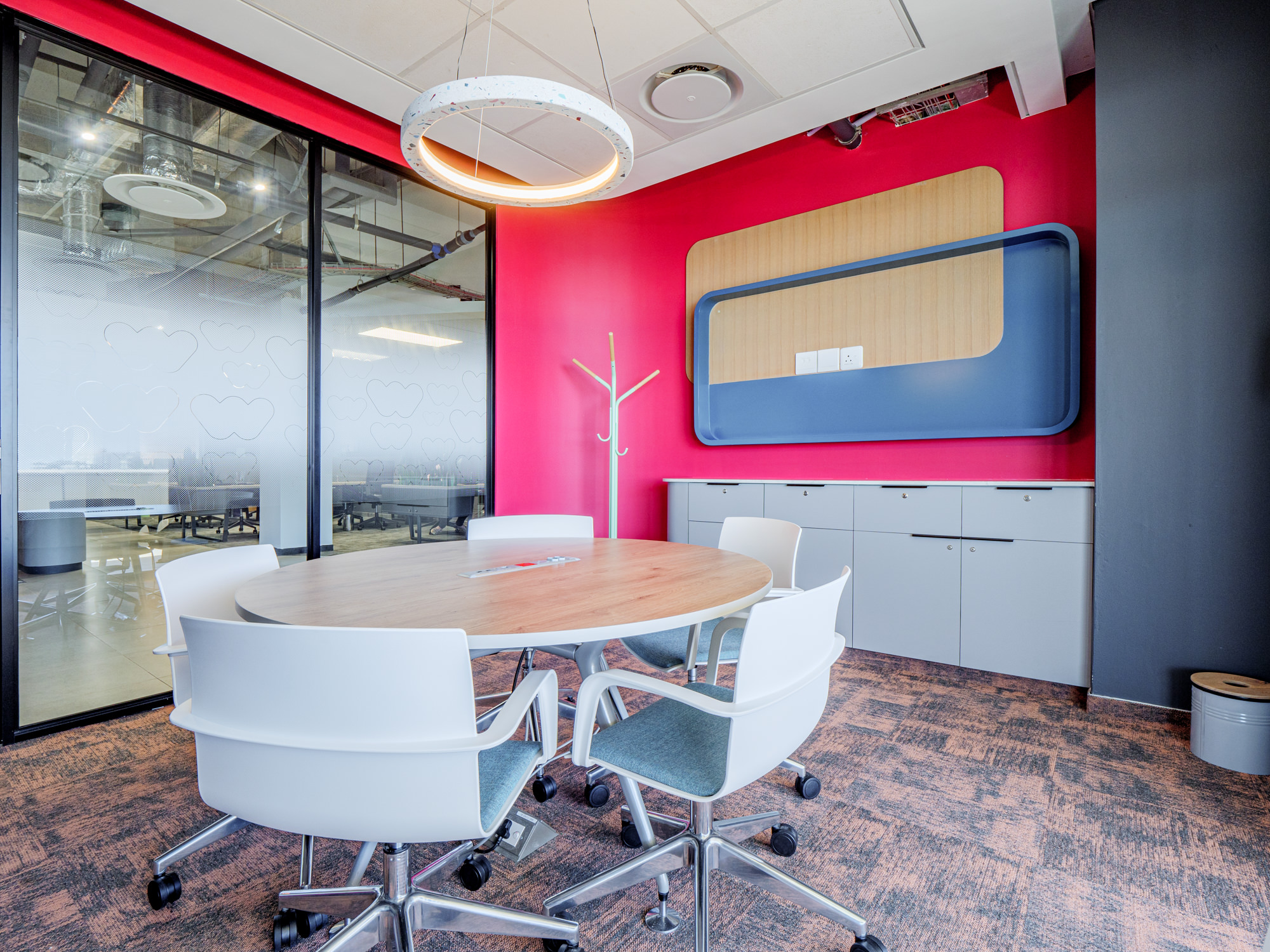
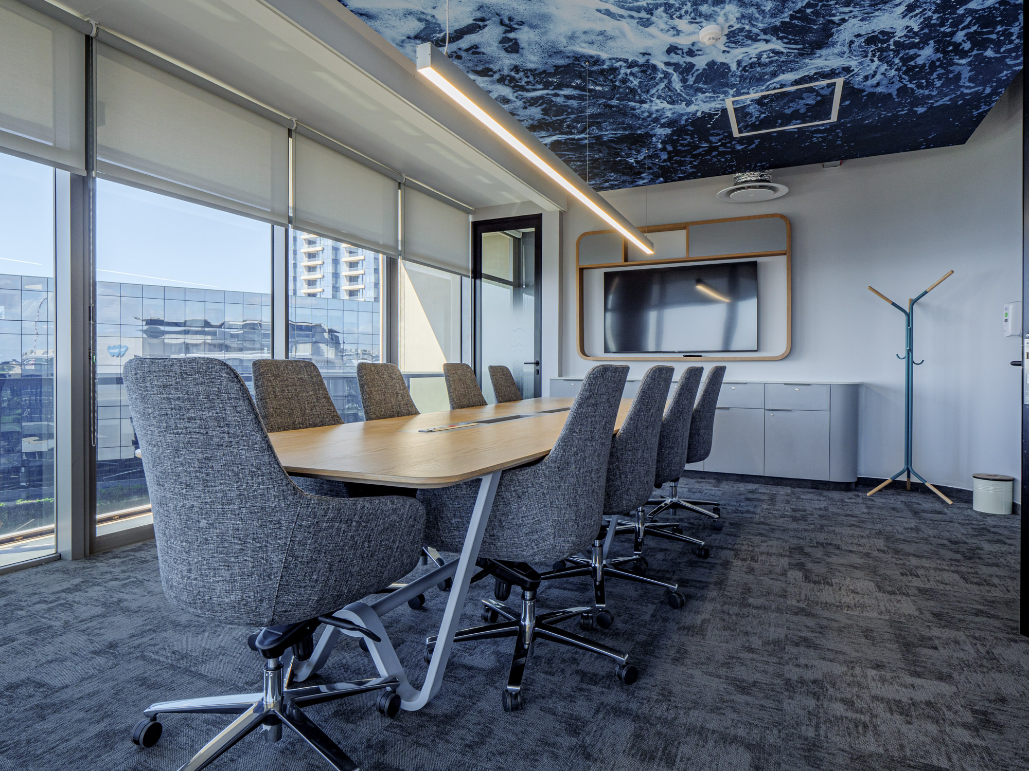
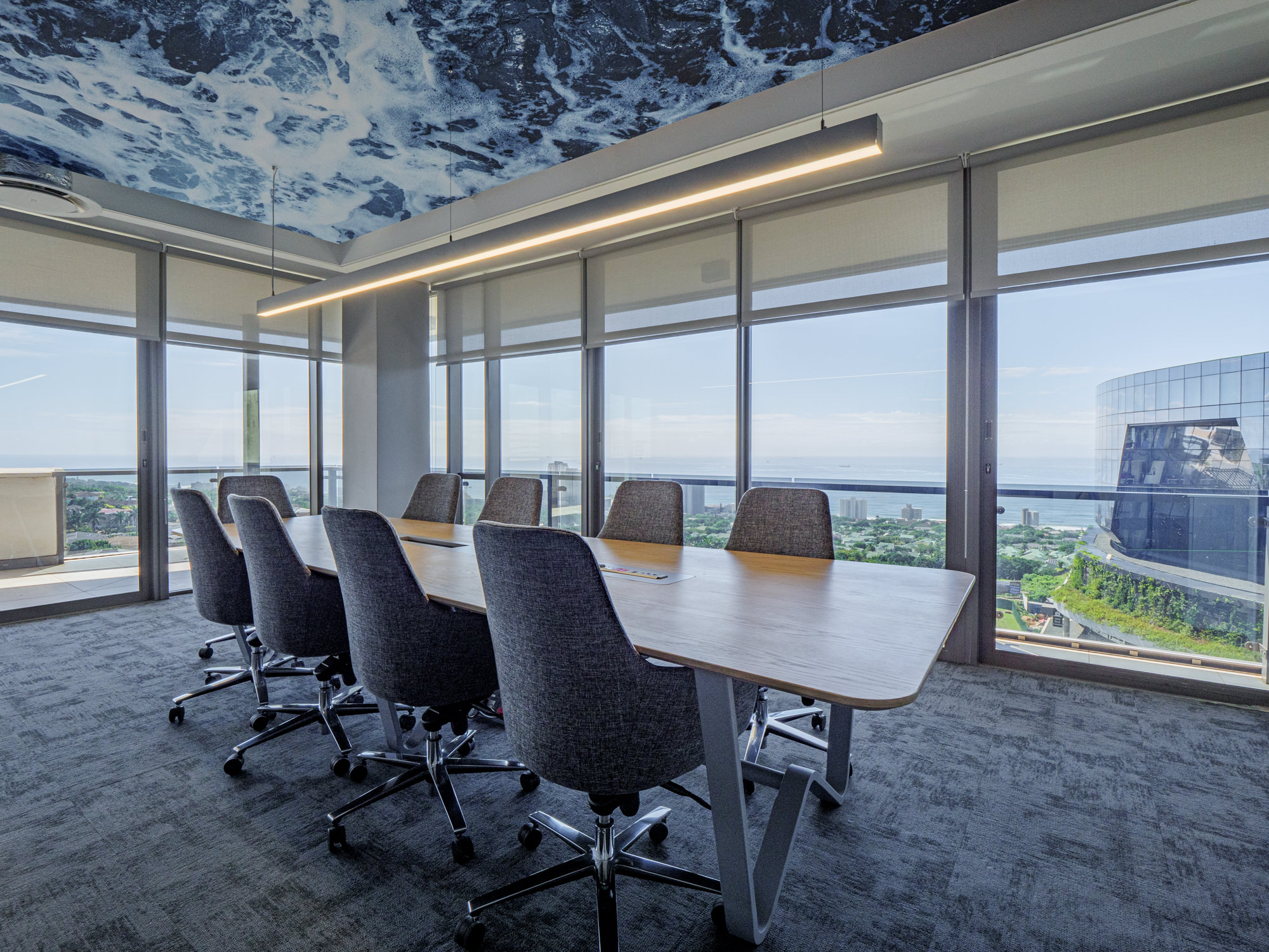
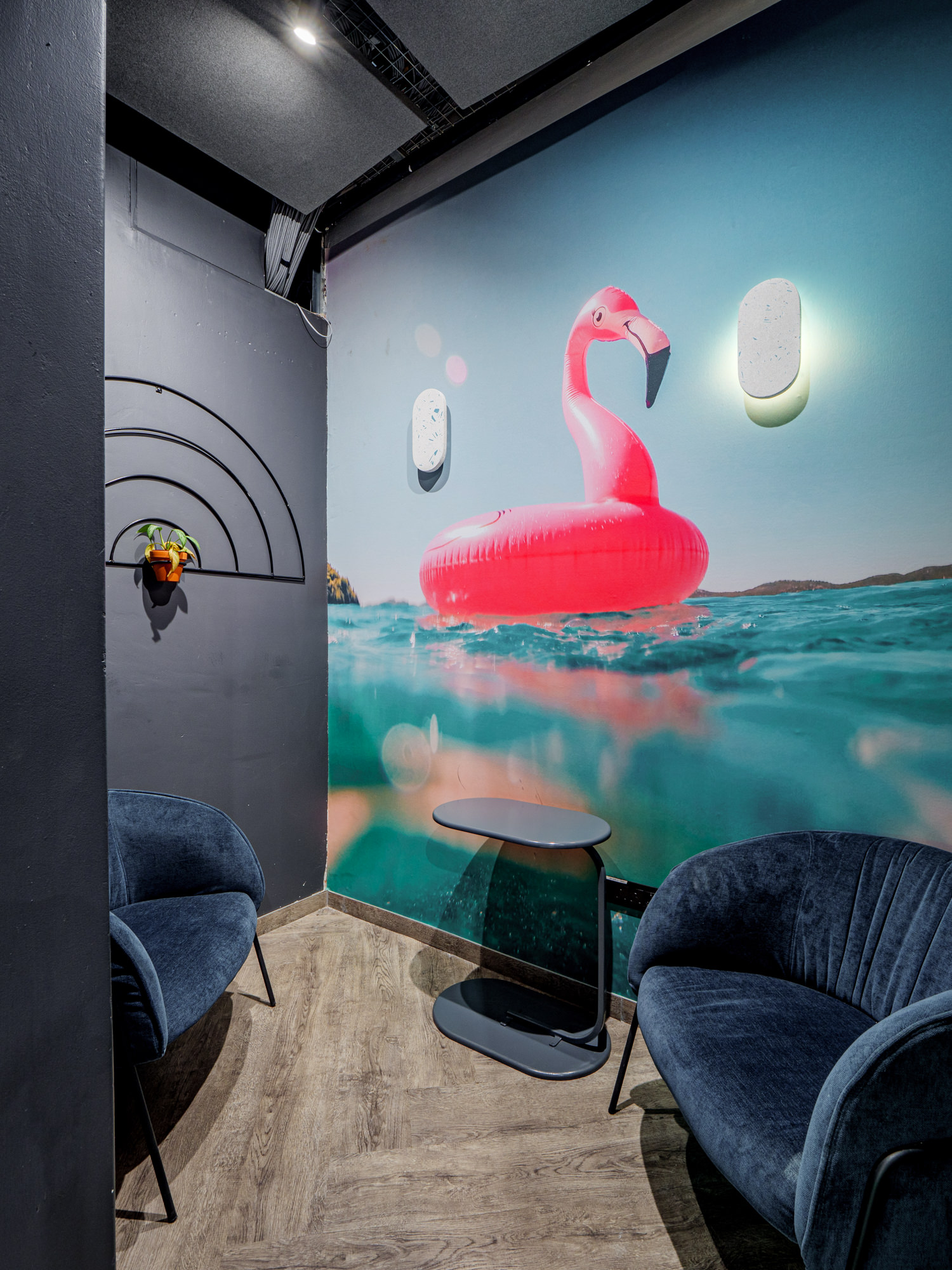
There are a variety of meeting rooms located throughout the workspace, which range in size and features to offer flexibility and dynamism. From dedicated meeting rooms to neon lit pods, there is something for every format of meeting which encourages collaboration and communication at all levels.
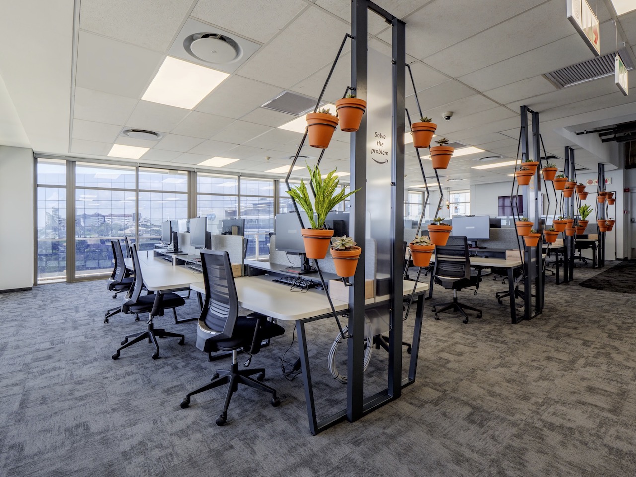
The open plan area is where the Webhelp experience truly comes to life. With a focus on “bringing fun to work”, this space is free-flowing, vibrant, and full of contagious energy. Using interchangeable signage elements ranging from fabric printed lightboxes to framed prints, the dynamic spirit of Webhelp shines through, with the creation of campaign ambassadors within each of the working areas.
Upliftment, training and growth are key ideologies of the Webhelp value proposition, and the training area has been designed for flexibility with a modular approach, being able to expand into larger multi-use spaces or closing into smaller more traditional training environments.
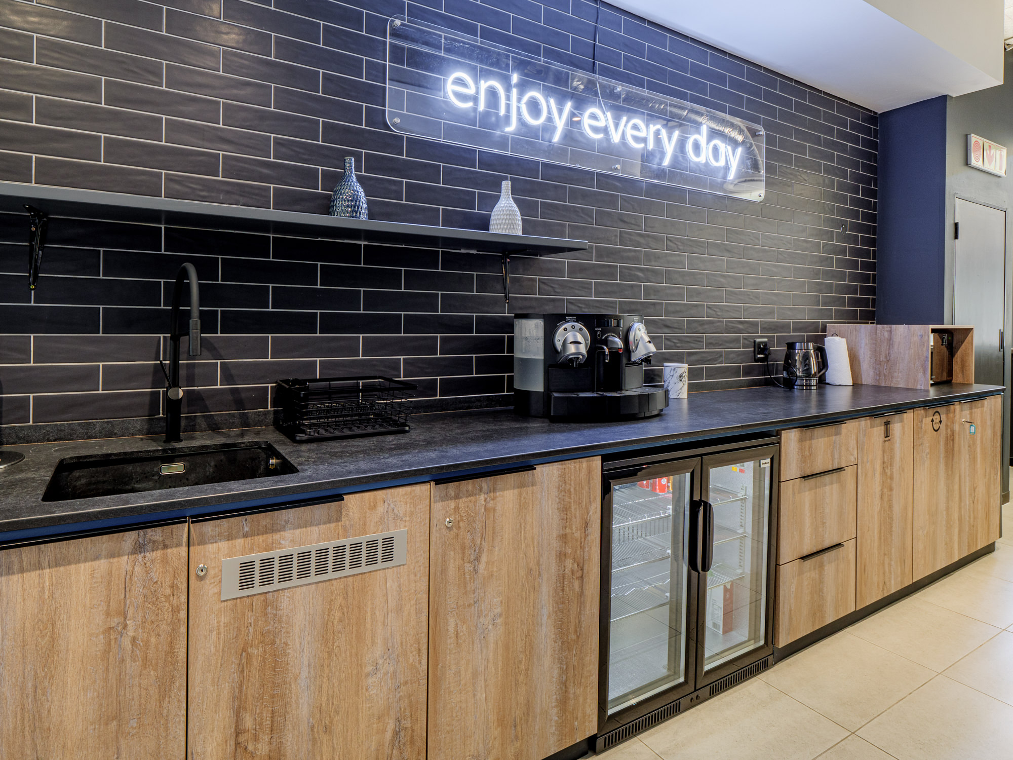
LED signage used throughout the workspace is visually powerful, energetic and displays positive and motivational messaging. Lighting plays a big part in the Webhelp workplace with unique fixtures featuring in key areas. Webhelp messaging features on the walls, banners and signage, are not only used to communicate the core values of the company, but also deliver quirky notes, which complement the creative and fun ambiance in the office.
ClientWebhelpLocationDurbanCategoryContact CentreArea2915m²Circa2022

